Image 1 of 6
Image 2 of 6
Image 3 of 6
Image 4 of 6
Image 6 of 6
Bathymetric Map of the Soul
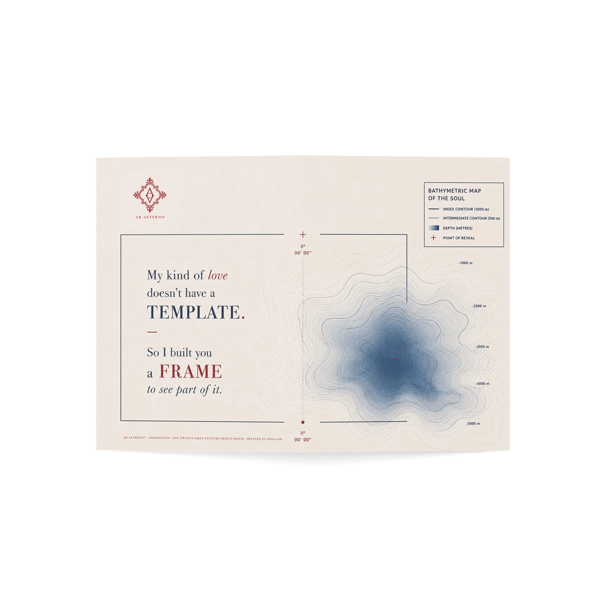
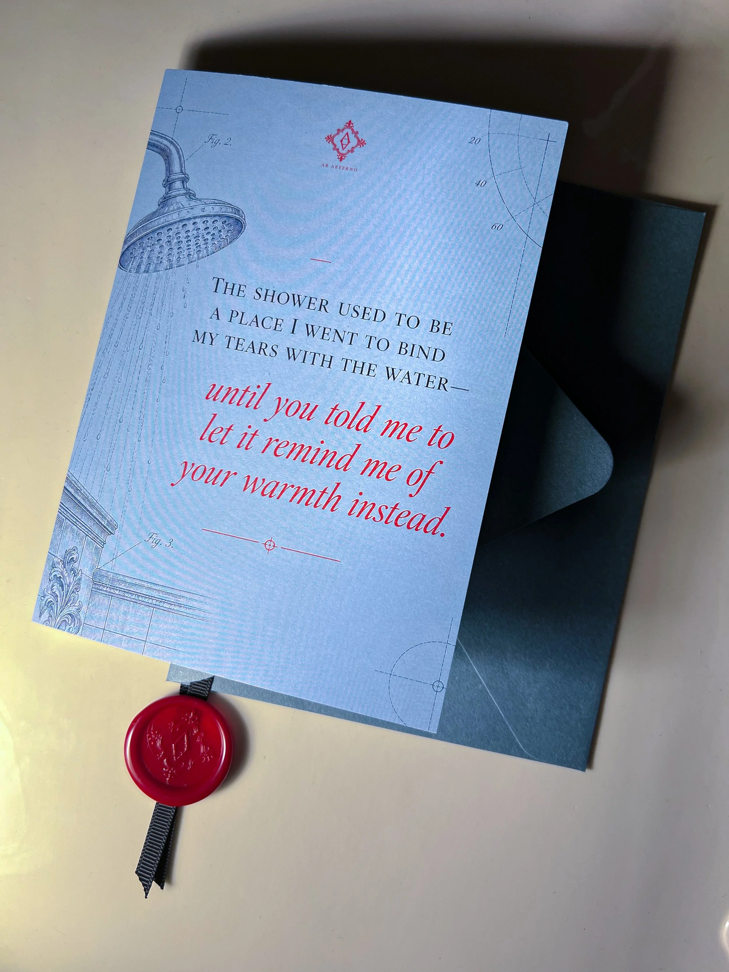
As the flagship correspondence card of Ab Aeterno, Bathymetric Map of the Soul is a true dialogue between its founders. A wrote the words, while J—fittingly, a draughtsman by trade—designed the illustration.
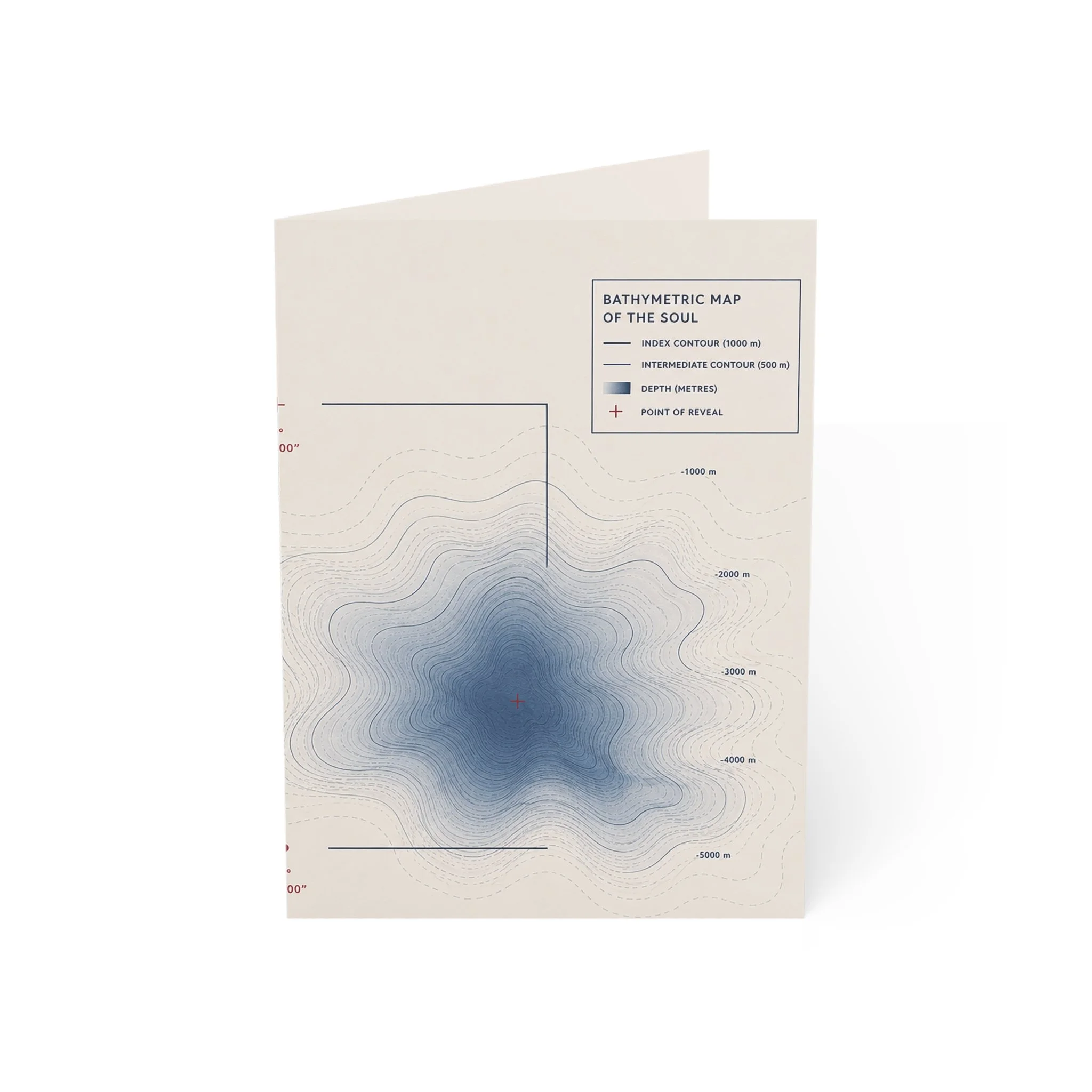
The card borrows the language of hydrographic mapping to chart something considerably less cooperative: the human soul.
Depths are measured. Contours are drawn. A structure begins to emerge.
Yet the most vital elements cannot be reduced to a diagram.
There is no universal template for another person’s inner topography. At best, one can learn its depths, recognise its contours, and become attentive enough never to mistake the surface for the whole.
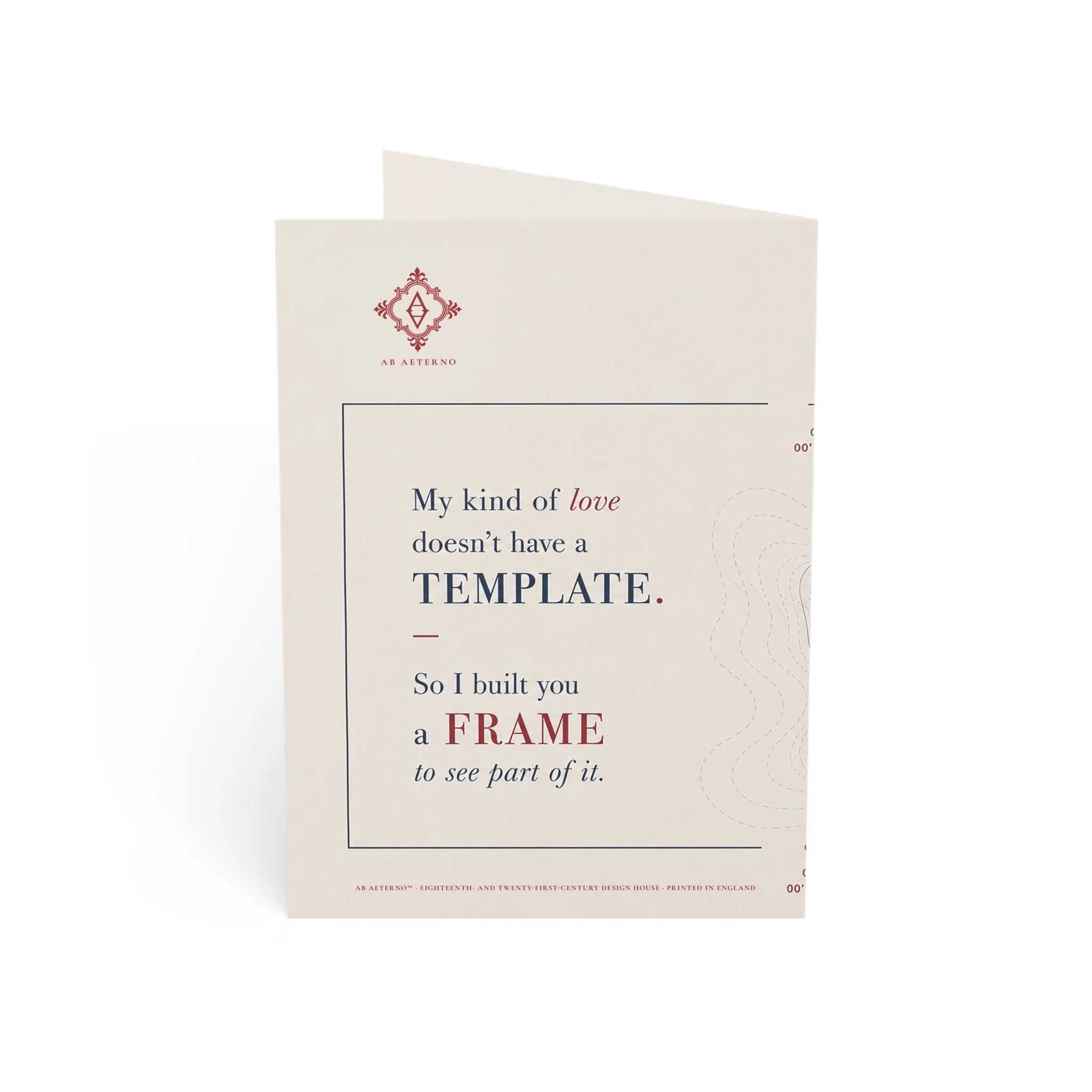
The card is designed to be opened fully so that the composition may be seen as a single uninterrupted work. Across the spread, the written statement occupies one side while the bathymetric contours descend across the other towards the marked Point of Reveal. The fold itself becomes part of the composition: language on one side, depth on the other.
The Words
My kind of love
doesn’t have a
TEMPLATE.—
So I built you
a FRAME
to see part of it.
The phrasing is deliberately restrained. The frame does not claim to contain the whole soul. It merely provides a means of seeing some portion of what would otherwise remain beneath the surface.
This design also marks the moment the House discovered its visual identity.
A had originally envisioned something far more restrained: miniature broadsides. Small, elegant eighteenth-century sheets—historically sensible, perhaps even a bit precious.
J swept in with an immediate and emphatic absolutely not.
He wanted something bolder: a definitive House signature that would feel effortlessly at home in the present. To make his point, he directed A’s attention very specifically to the sleek environs of Bal Harbour Shops.
Thus began a creative tussle: A’s instinct to distil the cards into miniature historical artefacts versus J’s insistence that the House should not merely reproduce the eighteenth century, but speak from it into the present.
A eventually ceded to J’s direction and was subsequently confronted by a humbling realisation:
He was entirely right.
When J’s final illustration emerged, A’s recorded response was simply:
“Wow. That is... quite the intensity.”
A remark, ironically, that many people make about A herself—usually without comprehending the depths beneath her own surface. 💀
It took A a little longer to realise that J had quite literally illustrated the very ethos they were trying to build Ab Aeterno around: no matter the discipline, object, system, or circumstance, never lose sight of the soul moving through it.
Perhaps this is why the two founders work as mirror images of one another: each recognises in the other what they themselves might have done differently, yet somehow exactly what they meant all along.
Bathymetric Map of the Soul is the artefact of that friction.
From that point onward, Ab Aeterno’s correspondence cards would never look the same.
A flagship card for the person who has seen beneath your surface—and stayed.
Product Features
Included with Standard Orders: A contrasting blue-grey envelope and crimson Ab Aeterno peel-and-stick wax seal mounted on black grosgrain ribbon.
To keep it as a bookmark: Leave the ribbon intact.
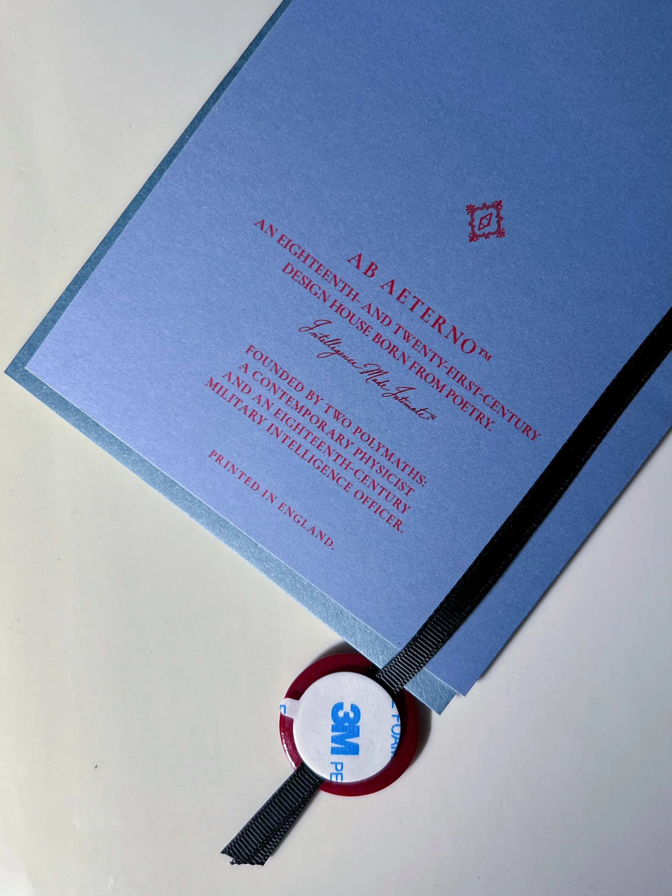
To seal the envelope: Enclose the card and close the flap. Cut the long ribbon just above the seal. The short ribbon below may be trimmed or left to dangle. Peel away the backing and press the seal into place.
Direct-to-Sender Orders: Prepared for posting in a classic kraft envelope.
Dimensions: 5 × 7 inches
Premium Archival Paper: Printed on ultra-premium Mohawk Superfine 324 GSM / 120 lb Cover card stock with a matte finish. Acid-free and pH-neutral, the paper is designed for long-term preservation and resistance to yellowing or degradation over time.
Format: The card is designed to be opened fully, allowing the illustration to be seen as one continuous composition rather than as separate front and interior surfaces. In its expanded form, the image reveals its intended relationship between language, contour and depth.
Interior: Left blank for your own dedication, message or correspondence
Origin: Printed in England
U.S. Shipping: Free shipping within the United States
Care Instructions:
Gently wipe with a soft, clean, dry cloth, moving from the centre outward.